Initializr: With Great Templates Comes Great Responsivity!

Today I am proud to announce that a "Responsive Template" is now available on Initializr! It will help you dealing with all the various devices used to display your site. Mobiles, tablets, netbooks, laptops, desktop monitors, HUGE desktop monitors... Making your site work correctly on all these devices is a real nightmare. Well guess what? This nightmare is... absolutely not over! But as least, the boilerplate code of a responsive layout is now here to make your life easier.
About responsive web design
For those who have been living in a cave for the last few months (understand: for those who have a life and don't spend days reading tweets and blogs) you probably need a short update about what a "responsive" design is.
The concept, introduced by Ethan Marcotte , is pretty simple: the page layout should adapt depending on the screen size so it’s always convenient and easily readable for the user. On mobile for instance, it’s more comfortable to get a minimalistic one-column vertical view than getting a 2 or 3 columns view – which is perfect for desktops. What about tablets? Maybe we can also adapt the layout to fit their medium size screen too? Since we can’t know the screen size of our users’ devices, well it should just work everywhere.
To design a responsive layout, we have to forget about the usual static 960px width layouts and go fluid with percentage widths and media queries.
A fluid layout with percentage widths
The first thing our page needs is a "fluid" layout. A layout is called fluid when the text adapts its container size and when proportions are preserved when the window is resized. To get this working we can't have any hard coded static value for widths, horizontal padding nor horizontal margins. We can basically only use percentages:
#this-is-a-fluid-container {
  width: 50%;
  padding: 20px 10%;
  margin: 0 10%;
}
If you strictly follow this approach, your layout will scale perfectly from a small mobile screen to a huge desktop monitor. It’s already pretty cool, but you still have the same layout on every device, which is far from ideal! Don't worry, now comes the fun part with media-queries to solve this problem.
Mobile-first approach media queries
Media queries are a cool way to specify different styles depending on the device used (by aiming particular screen resolutions or orientations for example). The mobile-first approach is the equivalent of progressive enhancement for media-queries. The principle is to start with the lowest resolution devices and then enhance the experience for bigger screens.
The mobile view
Here is the very simple mobile display of the responsive template. It doesn't take into account any media query yet:
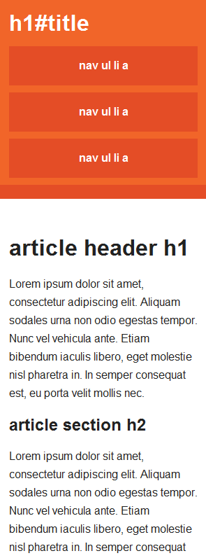
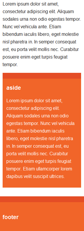
You can see that an aside orange block is located at the bottom of the page:
The intermediate view
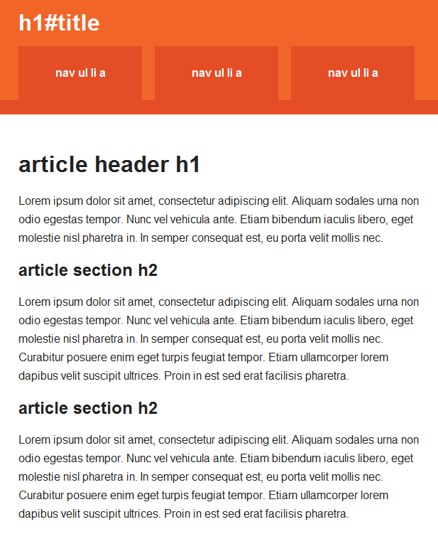
If we display this page on a larger device (like a tablet or a wide smartphone), the vertical menu gets a little bit annoying and ugly because its buttons are stretched too much. We can use a media query to display them horizontally for screens larger than 480px like this:
@media only screen and (min-width: 480px) {
  nav a {
    float: left;
    width: 27%;
    margin: 0 1.7%;
    padding: 25px 2%;
    margin-bottom: 0;
  }
}
Which has the following result:
The wide view
We now have a more convenient menu for tablets. Awesome! But what if we open this page on a laptop now? They have bigger screens so the vertical one column layout might not be the best fit for these devices. We would rather prefer a 2 columns layout, so we can move the aside block and the menu to the right of the page, and keep the content on the left. Let's use a second media query to do that for resolutions higher than 768px:
@media only screen and (min-width: 768px) {
  #title {
    float: left;
  }

  nav {
    float: right;
    width: 38%;
  }

  #main article {
    float: left;
    width: 57%;
  }

  #main aside {
    float: right;
    width: 38%;
  }
}
This is what we get on a screen of approximately 900 pixels wide:
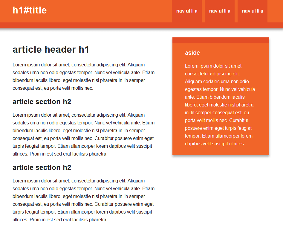
We now have a nice 2-columns desktop view. You see, it wasn't that hard to start from the mobile version first! I admit it might not be intuitive at first, but you get used to it pretty fast, and it's definitely cleaner.
The maximum-width view
Last but not least, we want a decent display on wide screens. If we leave it as it is now and open the page on a wide screen, a 5 line paragraph would be turned into an awful huge single line, which is terrible for readability. We need a maximal width limit to avoid this on wide screens. This limit can be anything: 960px, 1140px, 2000px, whatever, just choose one that make sense for your site.
In our case I picked 1140px, which suits well 1280 pixels wide screens, the most common resolution. An old school wrapper with fixed width and auto margins does the job perfectly:
@media only screen and (min-width: 1140px) {
  .wrapper {
    width: 1026px; /* 1140px - 10% for margins */
    margin: 0 auto;
  }
}
I've set the wrapper’s width to 1026px (1140px – 10%) because on the previous layouts the margins were set to 10%. Therefore if we resize the browser it will move from one layout to another seamlessly. Here is the widest layout we can get:
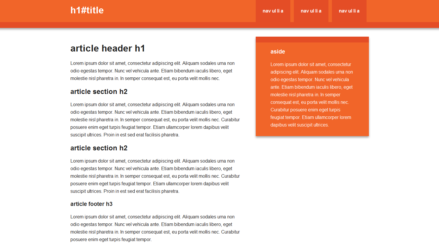
All right! We’re done with media queries!
Christmas presents for nice web developers
Since you've been very nice this year, here are some other presents for you!
1st gift: A Live Demo!
There is now a live demo of the responsive template to see if it works as expected before downloading anything. This is also particularly convenient to see how it runs on your mobile or tablet.
You can find it on initializr.v1v2.io/try
2nd gift: The Golden Ratio
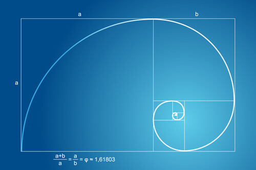
This responsive template comes with some golden ratio black magic. You may have heard of it, it’s a weird mathematical proportion that our stupid brains are supposed to like. Even if its effects are pretty uncertain, many designers and artists like to use it, hoping people will subconsciously like their work more. I’ve set the proportions of the left and right sections of the desktop view to 62% and 38% (take margins into account) so it always matches the golden ratio as you resize the browser.
Here is an interesting tutorial about how to apply it to your layout. Feel free to use this black magic or not, but don’t go crazy with it, this is more myth than science.
3rd gift: Readability For The Win
This new template comes with pretty decent styles for a good readability. Remember that readability is absolutely crucial for your users. It will make them actually read what you have to say instead of just looking at pictures, and if this reading is pleasant they will be more eager to subscribe, retweet, buy your stuff or whatever you want them to do. This is a pretty big deal!
Here is some advice to improve readability:
- Use a big font size and an adapted line height (like 16px / 24px).
- A line should have approximately 80 characters.
- Avoid paragraphs of more than 5 lines.
- Avoid sections of more than 5 paragraphs in a row.
- Put stuff between paragraphs when you can and when it makes sense so the reader can breath before he starts a new one (charts, pictures, code, decorations...).

4th gift: A Github repository for this responsive template
Some of you might have noticed that Initializr's Github repository is the website's repository, not the template's. So it's pretty useless for you except if you want to know how to generate archives in Java! I’ve created a new Github repo for this responsive template, so you can fork it and suggest modifications and improvements to it. Way more useful, yay!
Here is the new repository: github.com/verekia/initializr-template.
